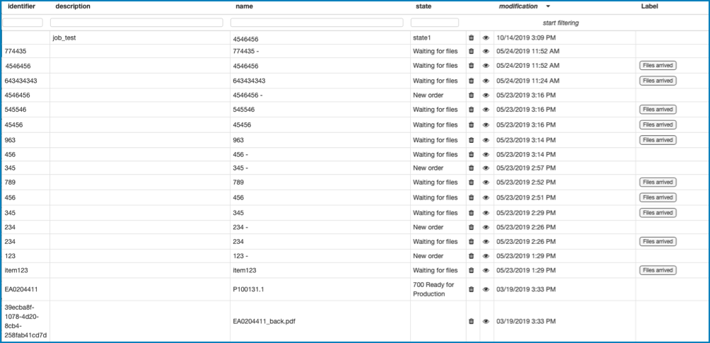
The Job Table component adds a dedicated Job table. It reads
the data from the database and displays it in the table.
Note: CLOUDFLOW returns recursive Job data. This means that Job information of nested
Jobs are also returned.
The component has the following configuration options:
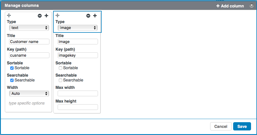
Columns: here you can manage the Job table columns.
Select to open
the Manage columns tab.
Select + to add a column.
Select to drag the column to another
position.
Select to remove the column.
Select to close the tab.
type: here you can select the column type.
Depending on the type you select, the sort and search options will
differ. Options:
text: if you select this type, the column
content will be interpreted as text.
styled text: if you select this type, the
column content will be interpreted as styled text.
number: if you select this type, the
column content will be interpreted as a number.
image: if you select this type, the
column content will be interpreted as an image. Extra
options:
Max width: here you can select
the maximum width of the image.
Max height: here you can select
the maximum height of the image.
true/false: if you select this type, the
column content will be interpreted as a boolean. See
mapping type for more boolean
functionalities.
date (ISO-format): if you select this
type, the column content will be interpreted as a date. Extra
options:
Display format: here you can
define if you want to display the local date only or the
local date and time.
link: if you select this type, the column
content will be interpreted as a link. Extra options:
Link label format: here you can
define the label of the link.
unit: if you select this type, the column
content will be interpreted as a unit. Extra options:
Unit type: here you can select
the unit type (for example
length,
resolution,
scaling...
Storage unit: here you can select
the storage symbol.
mapping: if you select this type, you can
create a fixed list with column items and map them in order to
display them as an image, an icon or text in the column. Select
at the bottom to define the fixed
list and the mappings. For each value you want to map, you have
to add a mapping configuration ().
Type of the values: here you can
select the type of the values in the fixed list.
Compare: here you can enter the
value you want to map.
Compare options are:
For numbers : 'less than or equal', 'less
than', 'equal to', 'greater than', 'greater than
or equal'.
For text: 'equal to', 'contains text like',
'begins with', 'ends with'.
Display: here you can select the
type of value to which you want to map.
Type options:
Icon: if you select this
option, the predefined value will be mapped to and
displayed as an icon. You can select the icon in
the icon list.
Image: if you select this
option, the predefined value will be mapped to and
displayed as an image. You can define the image
URL in the text field and you can define the
maximum width and height.
Text: if you select this
option, the predefined value will be mapped to and
displayed as text. You can enter the text in the
text field.
Style Class: here you can enter
the style you want to map.
Selector: here you can enter text
in a text field that will be displayed in case the
column content is searchable.
Action: here you can enter the
actions that will be referenced to.
Example
You have table with a column
Status, where you want to display the print
status of a file. The values of that column are retrieved
from the database as a boolean (true or false)
from a field called print. In your table you want to
map the boolean value true to an icon. To do so, take
the following steps:
Add a column to your table with
mapping as the column
Type, Print Status
as the Title and print
as the Key (path).
Select to open the mapping
configuration.
Select true/false as the
value type.
Select icon as the
Display type and select the
icon you want to use to display the true
values, for example the Printer icon ()
If needed, enter a text in the text field that will
be used in the file selector (for example All
files that are ready to print). In that case,
make sure to select the checkbox
Searchable.
The files that are ready to print are now displayed in
the column Print Status with the icon . You can also filter on all the
rows that contain All files that are ready to
print.
view: if you select this type, a column
with the view icon is present. Selecting this icon can
trigger an action. See View click for more information.
remove: if you select this type, a column
with the remove icon is present. If you select this
icon, the Job will be removed from the table.
next state buttons: if you select this
type, a column with the next state buttons is present. If next
states are set to a Job (via the Update
Job node), these will be visible in this column.
If you select one of the states, this state will be set to the
Job.
title: here you can enter the title of the column
that is displayed on the column header.
key (path): here you can define the key of the
Jobs collection in the database that you want to display in the column.
If you start typing, a list with one or more auto fill suggestions
appears. Select the key you want to use.
If
you want to display a column with the Job names, you have to enter
name in the field key
(path).
sortable: if you select this checkbox, you can
sort the content in the column.
searchable: if you select this checkbox, a search
field appears and you can search the content in the column.
Default search: here you can specify a default
search string.
width: here you can select the column width.
Filter: here you can manage filters for the Jobs content
that should be displayed. Select to open the tab where you can manage the
filters.
Select Add rule or Add
group. A rule is a single rule, a group is a group of
single rules.
Select the criteria.
If you want to add a rule for a combined filter, select
AND or OR and define
the additional rules or groups.
If needed, select Delete to delete a rule or a
group of rules.
Select Save.
Example
If you want the column only to display the Jobs of
which the identifier start with 123, you can use this filter:
identifier begins with 123
If you want to display the
Jobs of which the identifier start with 123 and with state For
approval, you can
use:
identifier begins with 123
AND
state equal For approval
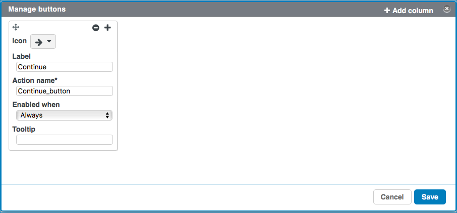
Topbar buttons: here you can define buttons
that appear at the top of the table. Select to open the Manage buttons dialog. Each
column represents a button with its icon and text above the table.
Select + or Add column to add a
column.
Select to
drag the column to another position.
Select to
remove the column.
Select to
close the tab.
Icon: here you can select an icon you want to use for the
button.
Label: here you can enter the name that appears on the
button.
Action name: here you can define a name for an action. The
action name appears in the section Actions in the component
settings. For each action name there is a dedicated action. See Working with Actions for more information.
Enabled when: here you can define when the button is
available and the action can be triggered. Options:
Always: the button is always enabled.
No selection: the button is enabled if no table row is
selected.
Only one selected: the button is enabled if only one
table row is selected.
One or more selected: the button is enabled if one or
more table rows is selected.
Multiple selected: the button is enabled if two or more
table rows are selected.
Conditional multiple: the button is enabled if one or
multiple rows are selected that match a conditional query. Select to open the tab
to create the rule(s) for the conditional query.
Conditional only one: the button is enabled if one row is
selected that matches a conditional query. Select to open the tab
to create the rule(s) for the conditional query.
Tooltip: here you can enter a tooltip that appears when
hovering over the button.
Select Save to save the configuration.
Sort by: here you can select the key on which you want to
sort the columns.
Order: here you can define the sort order.
Save sort by and order: if you select this checkbox, the
sort order of the columns is saved after refreshing the page.
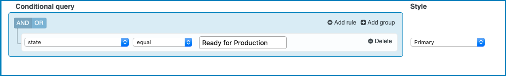
Row conditional styling: here you
can define style classes for each row based on conditions. Select to open the dialog where you
can manage the conditional queries. To define query and a matching Style, follow these
steps:
Define the Conditional query:
Select the key from the drop-down list and select the matching criteria.
If you want to add a second rule or group, select AND or
OR. A rule is a single rule, a group is a group of single
rules.
Select the Style to apply to this query.
Select to
add define another Conditional query and
Style.
ExampleIn this example, the Primary style will be applied to all to table
rows with the key state that is equal to Ready for
Production.
Disclosure: here you can define options regarding the
disclosure.
Add disclosure button: if you select this
checkbox, a disclosure button is added. This disclosure button can be
expanded or collapsed to show more details about the Job.
Disclosure content: here you can select the
component that will be displayed when the disclosure button is
expanded.
Input type: here you can select the input type
that sends data to the disclosure content. Options:
default: if you select this option, the
default input type is selected.
workflow: if you select this option, you
can specify a workflow to input data in the disclosure content.
In this case, a workflow is started when the disclosure content
is revealed. The variables generated by the workable can be used
in the disclosure content.
Workflow*: here you can select the
workflow to start when the disclosure content is revealed. You
need to select a workflow that starts with a Start
From Web Request node.
Input*: here you can select the input of
the workflow.
Open workflow: if you select this link,
the workflow that you specified is opened in the Workflow
Editor.
Only one disclosure panel open: if you select
this checkbox, only one disclosure panel can be opened at the same
time.
Header: here you can define options regarding the
header.
stick to the top: if you select this checkbox,
the header of the Job table sticks to the top of the browser window when
scrolling through a long table.
Maximum rows: here you can select the maximum amount of
rows that is displayed in the table.
show page and amount of rows: if you select this
checkbox, the page and the number of rows are displayed in the table.
user configuration: if you select this checkbox, a
cogwheel appears when you preview the page with the VIEW
option and when you hover over the right side of the table header. When you
select the cogwheel, the user configuration opens where you can show or hide
table columns by selecting or deselecting the columns.
Style paging buttons: here you can select the style of
the paging buttons from the drop-down list. See Styling for more information about Pagebuilder
styles.
Refreshing delay: here you can select the delay after
which the page is automatically refreshed. Select No
refreshing if you don't want automatic refreshing of the
page.
Style: here you can select the style. See Styling for more information about Pagebuilder
styles.
Note: The general style will not overwrite the style of a
component.
Style
Background Color: here you can select the background
color.
Font Color: here you can select the font color.
Actions
With Actions you can manage actions that occur after a
trigger. The following triggers are available:
Row: this trigger will start an action if you click
on a row in the Job list.
Double click row: this trigger will start an action
if you double click on a row in the Job list.
Select: this trigger will start an action if you
select and deselect a row in the Job list.
View click: this trigger will start an action if you
click (Job
details) in the Jobs list.
action: Image click:: this trigger will start an
action if you click an image in the Job table row. This trigger is only
available if an image column is defined in the Job table
Columns:
Topbar: actionName: this trigger will start an action
if you click a button in the Job table Topbar. This trigger is only
available if the button is defined in the Topbar
buttons:
 to open
the Manage columns tab.
to open
the Manage columns tab. to drag the column to another
position.
to drag the column to another
position. to remove the column.
 to close the tab.
 ).
). )
) is present. Selecting this icon can
trigger an action. See View click for more information.
is present. Selecting this icon can
trigger an action. See View click for more information. is present. If you select this
icon, the Job will be removed from the table.
is present. If you select this
icon, the Job will be removed from the table.  to open the Manage buttons dialog. Each
column represents a button with its icon and text above the table.
to open the Manage buttons dialog. Each
column represents a button with its icon and text above the table. to
drag the column to another position.
to
drag the column to another position. to
remove the column.
to
remove the column. to
close the tab.
to
close the tab. to open the tab
to create the rule(s) for the conditional query.
to open the tab
to create the rule(s) for the conditional query. to
add define another Conditional query and
Style.
to
add define another Conditional query and
Style.