Form
The Form component adds an input form to submit to KIOSK.
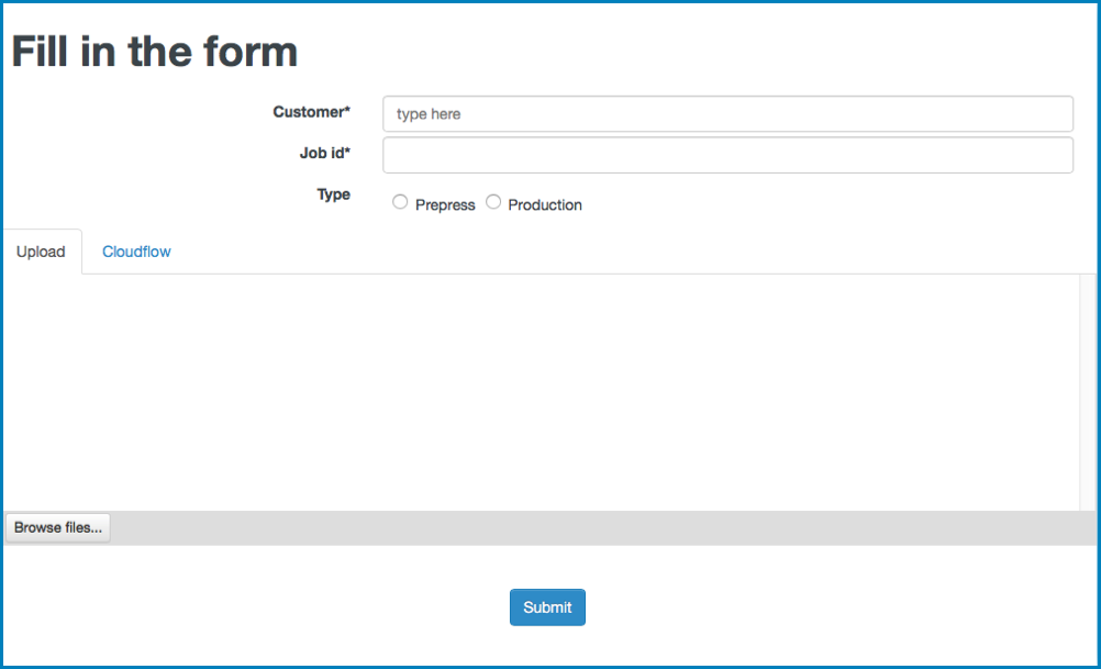
Note: You should only use this component in case you want to see and display a
form. If you don't want to display a form (for example if you want to
start a workflow with an Action (see Start Flow for more information), use
Start From Web Request.
The component has the following configuration options:
- Workflow: here you can select the workflow that contains
the form you want add in the HTML page. The drop-down list contains:
- All Jobs workflows, including the Standard Jobs Flow. See Job workflow for more information on Jobs workflows.
- All workflow that start with the Start From KIOSK node. The Start From KIOSK workflow can also do actions, for example passing information to a dialog or custom component.
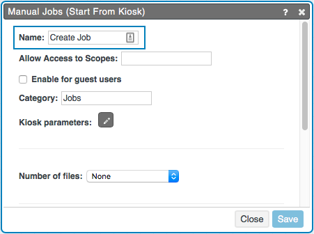
- Input: here you can enter the Input name of the workflow
that contains the form you want add in the HTML page. The input name is the name
that is entered in the field Name in the Start
From Kiosk node:
- Open workflow : if you select this option, the workflow will be added to the MARS App. This option is only available in case the Pagebuilder page is already part of a MARS App.
- Submitted message: here you can enter a message that will display after the asset is successfully submitted to the workflow.
Note: If you have selected a connector in VARIABLES to
retrieve the sample data to display , you can select ALT + click next to the fields
Workflow, Input and
Submitted message to show the pencil. Select the pencil to open Expression Builder.
- Reset fields after submit: if you select this checkbox, the form fields will be cleared after the asset is submitted to the workflow.
- Submit button text: here you can specify the text of the Submit button.
- Submit button layout: here you can define the style of
the Submit button. Options:
- Default: if you select this option, the layout of the button will be default.
- Main type: if you select this option, the layout of the button will correspond with the Main button style that you have defined in the Styling. See Styling for more information.
- Second type: if you select this option, the layout of the button will correspond with the Second button style that you have defined in the Styling. See Styling for more information.
- Show the cancel button: if you select this button, a Cancel button is displayed next to the Cancel button.
Actions
With Actions you can manage actions that occur after a
trigger. The following triggers are available:
- Submitted: this trigger will start an action if you have submitted an asset to the workflow.
- Canceled: this trigger will start an action if you have canceled.
See Working with Actions for more information on Actions.