Pagebuilder overview
Pagebuilder consists of different areas.
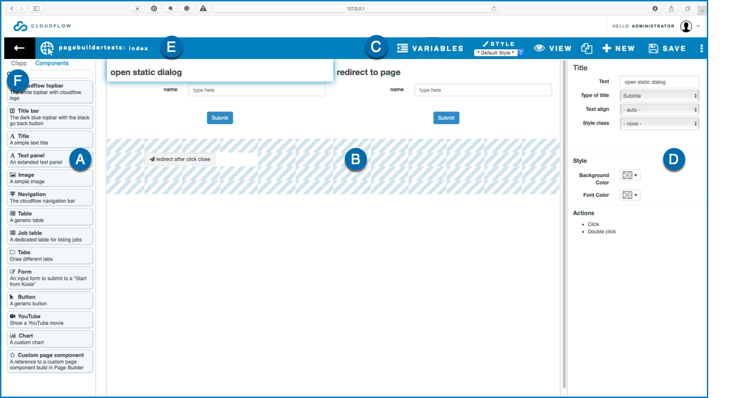
A: the components
These are the components you can use to build up the page. See Pagebuilder components for a complete overview of the Pagebuilder components.
B: the Pagebuilder work area
In this area you can drag and drop the components. See Build up the page for more information about building up a Pagebuilder page using components.
C: the topbar
The topbar functions.
- VARIABLES: when working with pages that use variable data, this area allows you to connect to a database collection, a data connector or a workflow object to test your page. See Working with Page Variables for more information.
- STYLE:
- Select a styling from the drop-down list to apply a general styling. This styling will not overwrite the styling of the components.
- Select STYLE to create a new styling.
- VIEW: select this button to preview the page.
- DUPLICATE: select this button to duplicate the page.
- NEW: select this button to create a new HTLM webpage with PAGEBUILDER.
- SAVE: select this button to save the current page.
Note: The system will automatically save the webpage every 30 seconds.
- Web Page Settings (
 ). See
Web Page Settings for an overview.
). See
Web Page Settings for an overview.
D: the component configuration
In this area you can configure the parameters of the selected component.
E: the title of the Pagebuilder page
You can edit the title by double clicking.
F: MARS App
If your Pagebuilder page is a part of a MARS App, Pagebuilder shows this tab. If you open it, the assets and the workflows that are part of the MARS app are displayed.