The Title bar component adds the dark blue topbar with the
black back button.
It has the following configuration options:
Icon: here you can enter the link or browse to the
activity icon you want to use in the title bar. The icon needs to be available
on a webserver.
Title: here you can enter the title that appears in the
title bar.
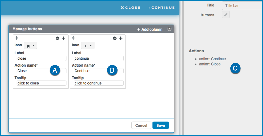
Buttons: here you add buttons that appear at the right of
the title bar. Select to open the Manage buttons
tab. Each column represents a button with its icon and text.
Select + or Add column to add a
column.
Select to
drag the column to another position.
Select to
remove the column.
Select to
close the tab.
Icon: here you can select an icon you want to use
for the button.
Label: here you can enter the name that appears
on the button.
Action name: here you can define a name for an
action. The action name appears in the section
Actions in the component settings. For each
action name there is a dedicated action. See Working with Actions for more information.
Tooltip: here you can enter a tooltip that
appears when hovering over the button.
Select Save to save the configuration.
Actions
With Actions you can manage actions that occur after a
trigger. If you have configured one or more button actions, there is a dedicated
action for each button:
A: Configured action 1
B: Configured action 2
C: Available actions. If you define a trigger, an action will
start. See Working with Actions for more information on
Actions.

 to open the Manage buttons
tab. Each column represents a button with its icon and text.
to open the Manage buttons
tab. Each column represents a button with its icon and text. to
drag the column to another position.
to
drag the column to another position. to
remove the column.
to
remove the column. to
close the tab.
to
close the tab.