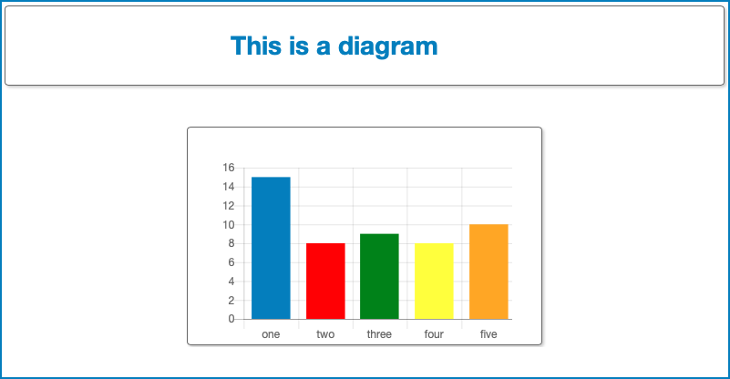
Dashboard container
The Dashboard container component adds a visual block.

The component has the following configuration options:
- Width: here you can define the width of the container.
- Height: here you can define the height of the container.
- Background: here you can define the background color.
- Border: here you can define the size and the color of the container border.
- Border Radius: here you can define the border radius that rounds the corners of the container's outer border edges.
- Margin: here you can select the top, bottom, left and right margins of the container.
- Shadow: here you can select the container's dropshadow
properties:
- The vertical and horizontal offset.
- The amount of blur effect.
- The color.
- Title
- Show title: if you select this checkbox, the container title is displayed.
- Title text: here you can enter the title text. Select the pencil to open Expression Builder.
- Title style: here you can define the title style.
Options:
- - none -: if you select this option, the title doesn't have a defined layout.
- Primary: if you select this option, the layout of the title will correspond with Primary style that you have defined in the Styling. See Styling for more information.
- Secondary: if you select this option, the layout of the title will correspond with Secondary style that you have defined in the Styling. See Styling for more information.
- Source location: here you can define the source location
of the container content. Options:
- file: if you select this option, the content is an externally referenced file.
- embedded: if you select this option, the content is embedded in the container. Select Edit to create or to edit the embedded content.
- Url (only available if Source location is set to file: here you can select the CLOUDFLOW URL of the external file. Select Go to editor to edit the file.
- Input type: here you can select the input type that sends
data to the container content. Options:
- none: if you select this option, no input is selected.
- default: if you select this option, the default input type is selected.
- workflow: if you select this option, you can specify a workflow to input data in the container content. In this case, a workflow is started when the container content is displayed. The variables generated by the workable can be used in the container content.