Custom Grid
The Custom Grid component adds a custom grid.
The component has the following configuration options:
- Collection: here you can select the database collection
from which the data is read and copied to the grid. Options:
- Custom Objects: if you select one of the custom objects collections, the data from this collection in the database is read. See Using custom objects in the database for more information on custom objects.
- The Jobs collection: if you select this option,
the data from the Jobs collection in the database is
read.Note: Job table is a dedicated component for reading Job tables.
- Start from DBIO: if you select this option, the
data is collected from a workable that was created by a workflow that
starts with the Start from DBIO and sets a reply
with the Set DBIO Reply.Note: In case you want to use filters in a generic table that is driven by a workflow containing a Start From DBIO node, the returning interface of HTTP Reply node must be a parameter columns with an array containing objects with a column interface. A column must contain a name as a string and a data_type as a string, number or boolean.
- Item ID: here you can define the key name of an item in the collection.
- Data Connector - Data Link : if you select this
option, the DATALINK connections set up on your CLOUDFLOW are connected
to read the data.
- Item ID: here you can define the key name of an item in the collection.
- File: if you select this option, the data from a
JSON file is read.
- Data file url: here you can define the URL to the JSON file you want to read the data from.
- Item ID: here you can define the key name of an item in the collection.
Note: you can use dynamic collections. Use the following syntax:- Jobs: nucleus.job
- Custom object: nucleus.customobjects.<name of collection>
- Dataconnector: dataconnector.<name>/<table name>
- Start From DBIO: whitepaperCRUD.<name whitepaper>/<input name>
- Filter: here you can manage filters for the database
content that should be displayed. Select
 to open the tab
where you can manage the filters.
to open the tab
where you can manage the filters.- Select Add rule or Add group. A rule is a single rule, a group is a group of single rules.
- Select the criteria.
- If you want to add a rule for a combined filter, select AND or OR and define the additional rules or groups.
- If needed, select Delete to delete a rule or a group of rules.
- Select Save.
Example
Have a look at the previous example with the database collection customobjects.customers. If you want the column only to display the customers that are blocked, you can use this filter:
If you want to display the blocked customers from Belgium, you can use:info equal blockedinfo equal blocked AND country equal BENote: Filter is not used with the *Define own list* collection.Note: If you want to use the filter on a boolean, select (custom), enter the key value in the first field, followed by equal and true or false.Example

In this case, the filter will filter on all keys of which the value is true.
- Height: here you can define the height of the grid.
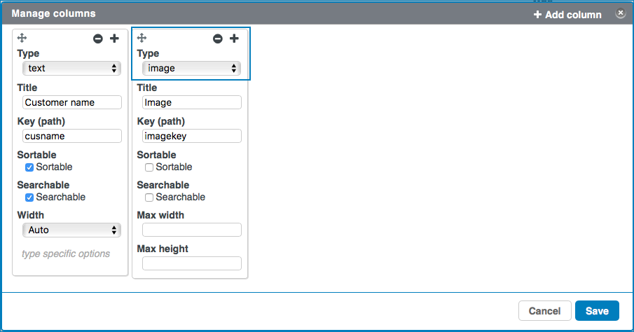
- Topbar buttons: here you can define buttons
that appear at the top of the table. Select
 to open the Manage buttons dialog. Each
column represents a button with its icon and text above the table.
to open the Manage buttons dialog. Each
column represents a button with its icon and text above the table.- Select + or Add column to add a column.
- Select
 to
drag the column to another position.
to
drag the column to another position. - Select
 to
remove the column.
to
remove the column. - Select
 to
close the tab.
to
close the tab.
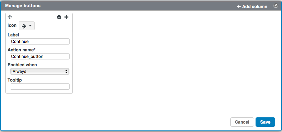
- Icon: here you can select an icon you want to use for the button.
- Label: here you can enter the name that appears on the button.
- Action name: here you can define a name for an action. The action name appears in the section Actions in the component settings. For each action name there is a dedicated action. See Working with Actions for more information.
- Enabled when: here you can define when the button is
available and the action can be triggered. Options:
- Always: the button is always enabled.
- No selection: the button is enabled if no table row is selected.
- Only one selected: the button is enabled if only one table row is selected.
- One or more selected: the button is enabled if one or more table rows is selected.
- Multiple selected: the button is enabled if two or more table rows are selected.
- Conditional multiple: the button is enabled if one or
multiple rows are selected that match a conditional query. Select
 to open the tab
to create the rule(s) for the conditional query.
to open the tab
to create the rule(s) for the conditional query. - Conditional only one: the button is enabled if one row is
selected that matches a conditional query. Select to open the tab
to create the rule(s) for the conditional query.
- Tooltip: here you can enter a tooltip that appears when hovering over the button.
Select Save to save the configuration.
- Select: here you can define the selecting options.
- unselecting: if you select this checkbox, you can deselect a selected item in the grid by reselecting it.
- multiple: if you select this checkbox, you can select multiple items in he grid.
- Item Type: here you can select the item type. Options:
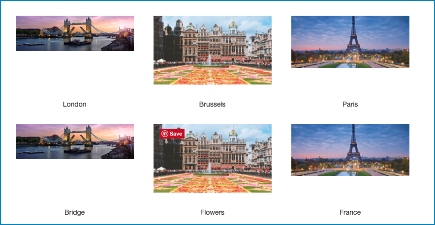
- Image: if you select this option, the items in your grid consist of images.
- Custom Page Components: if you select this option, the items in your grid consist of custom page components.
- Item URL: here you can select the custom page component or define the URL to it. You can use a relative path.
- Item Width: here you can define the maximum item width.
- Item Height: here you can define the maximum item height.
- Refreshing delay: here you can select the delay after which the page is automatically refreshed. Select No refreshing if you don't want automatic refreshing of the page.
Actions
With Actions you can manage actions that occur after a
trigger. The following triggers are available:
- Row click: this trigger will start an action if you click the row.
- Double Row click:: this trigger will start an action if you double click the row.
- action: Image click:: this trigger will start an
action if you click an image in the table row. This trigger is only
available if an image column is defined in the table
Columns:
- Topbar: actionName: this trigger will start an action
if you click a button in the table Topbar. This trigger is only available if
the button is defined in the Topbar buttons:
See Working with Actions for more information on Actions.