Chart
The Chart component adds a chart.
The component has the following configuration options:
- Type: here you can define the type of chart. Options:
- Line: a line chart is a way of plotting data points on a line.
- Horizontal bars: horizontal bars provide a way of showing data values represented as horizontal bars.
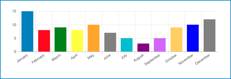
- Vertical bars: vertical bars provide a way of showing data values represented as vertical bars.
- Pie / Doughnut: pie and doughnut charts are divided into segments, the arc of each segment shows the proportional value of each piece of data.
- Radar: a radar shows multiple data points and the variation between them.
- Pie radar: a pie radar is a combination between the pie and radar charts.
- Width: here you can define the width of the chart.
- Height: here you can define the height of the chart.
- Source: here you can define the collection where the data
is retrieved from. Options:
- Custom Object: in this case, the chart data are retrieved from a Custom Object collection in the database.
- Start from DBIO: in this case, the chart data are
retrieved from the JSON data collected a workable that was created by a
workflow that starts with the Start from DBIO and
sets a reply with the Set DBIO Reply. The JSON
must return an array containing numbers or an object with the next
fields:
- Value (required): the numeric value of the specific point.
- Label: the label to show for that point. By default the text is empty.
- Color (optional): the color of the point. By default the color is CLOUDFLOW blue.
- Group (optional): the name of the group the point belongs to. The order of the points needs to be identical in all groups.
- Data Connector - Data Link : if you select this option, the DATALINK connections set up on your CLOUDFLOW are connected to read the data.
Note: you can use dynamic collections. Use the following syntax:- Custom object: nucleus.customobjects.<name of collection>
- Dataconnector: dataconnector.<name>/<table name>
- Start From DBIO: whitepaperCRUD.<name whitepaper>/<input name>
- Filter: here you can manage filters for the content that
should be displayed. Select
 to open the tab where you can manage the
filters.
to open the tab where you can manage the
filters.- Select Add rule or Add group. A rule is a single rule, a group is a group of single rules.
- Select the criteria.
- If you want to add a rule for a combined filter, select AND or OR and define the additional rules or groups.
- If needed, select Delete to delete a rule or a group of rules.
- Select Save.
- Show legend: if you select this checkbox, the legend is shown.
- Refreshing delay: here you can define the number of seconds after which the chart is refreshed.
- Default group name: here you can define the default group name.
Style
- Background Color: here you can select the background color.